
Dashboard Items
The dashboard is a user-friendly interface designed to provide a comprehensive view of compliance, security, and risk management. It offers real-time data, customizable views, and various tools to streamline workflows and support informed decision-making. For example, Charts display data through interactive graphs, Grids present data in a tabular format, and Maps allow for the placement of callouts, bubbles, or pie charts using geographical coordinates.
Dashboard items can be categorized into three main groups:
Data Visualization Items
The Compyl dashboard offers a variety of visualization tools to help you present your data effectively. Below are descriptions of the common visualization tools available in the dashboard compiler toolbox:
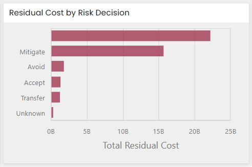
Chart: Displays data as bars, lines, areas, or other series types to visualize trends and comparisons across categories.
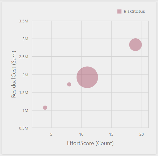
Scatter Chart: Plots data points along two numeric axes to reveal correlations and distribution patterns between two variables.
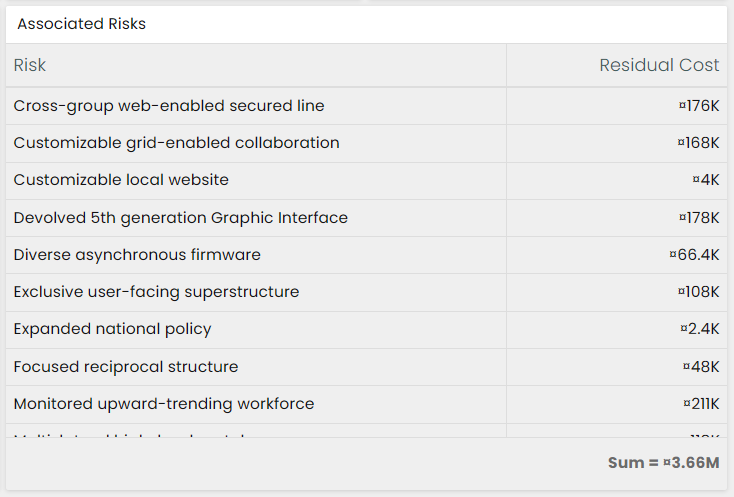
Grid: Presents raw or aggregated data in a sortable, filterable table of rows and columns.
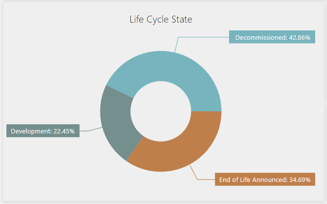
Pies: Shows data as proportional slices of a circle to illustrate each category's share of a whole.
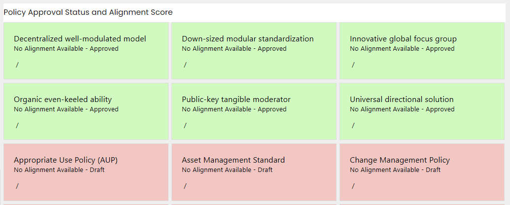
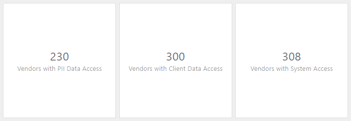
Cards: Displays one or more key metrics as compact, at-a-glance summary tiles, often with trend indicators.
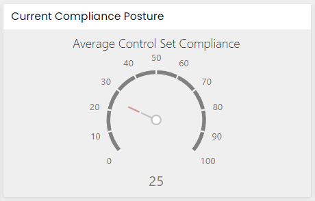
Gauges: Represents a single value against a defined range or target using a dial, arc, or bar-style indicator.
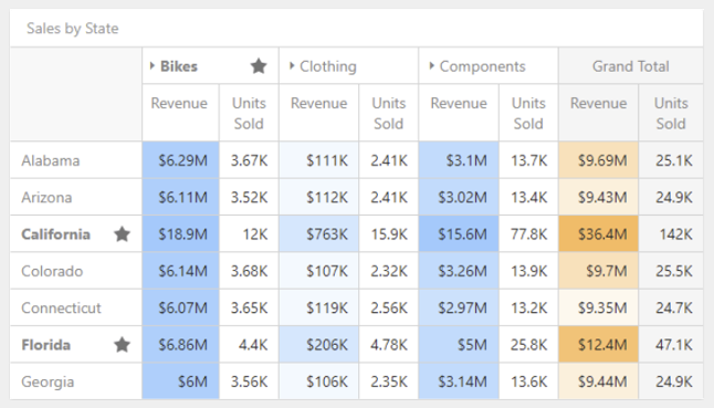
Pivot: Summarizes and cross-tabulates large datasets into rows and columns with configurable aggregations.
Text Box: Displays static or dynamic text content, such as titles, notes, or labels, within the dashboard.
Custom Item: Lets you embed a custom-built visualization or component into the dashboard layout.
Images: Displays a static image, such as a logo or picture, within the dashboard.
Maps:
-
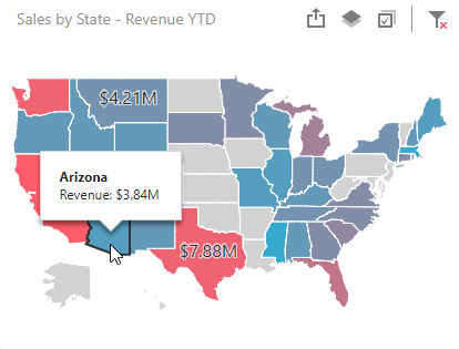
Choropleth Maps: Use color gradients to represent data values across geographic regions.
-
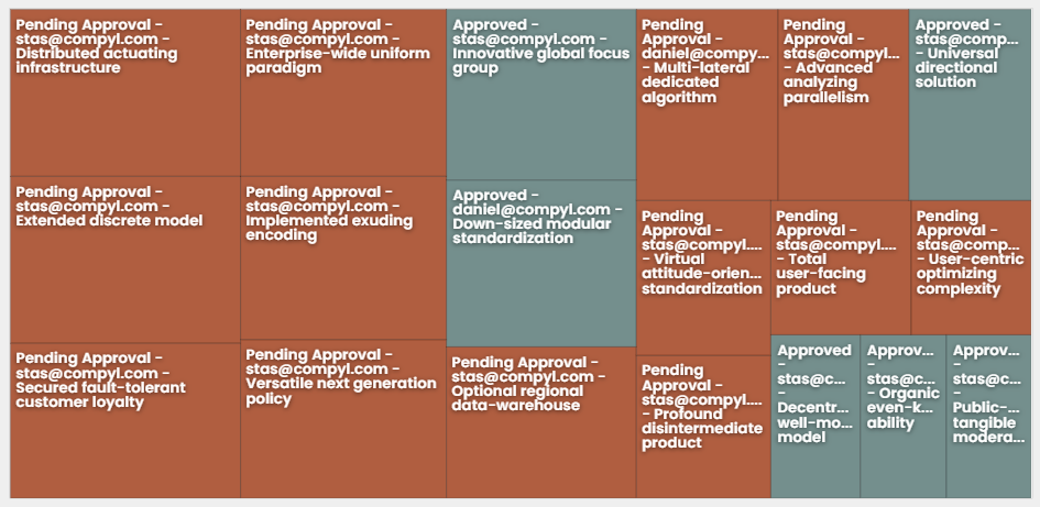
Treemap: Represents hierarchical data as nested rectangles sized and colored according to underlying values.
-
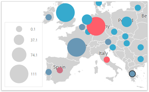
Geo Point Maps: Mark specific geographic locations with points to represent data values.
Filter Elements
To refine and interact with your data, the Compyl dashboard includes several filtering tools:
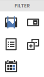
Data Filter: Allows users to define custom filter criteria to refine data sets. Supports various operators and conditions.
Combo Box: A drop-down menu that allows users to select one or more values from a list. Ideal for filtering data dynamically.
List Box: Displays a list of items that can be selected to filter data. Users can select multiple items at once.
Tree View: Provides a hierarchical view of data, allowing users to expand and collapse nodes to filter data at different levels.
Date Filter: Allows you to filter dashboard data based on the selected data range.
Layout Elements
The Compyl dashboard also includes tools for arranging and organizing your visualizations:
Grid Layout: Organize your dashboard items in a structured grid format. Provides flexibility in arranging items to fit the available space.
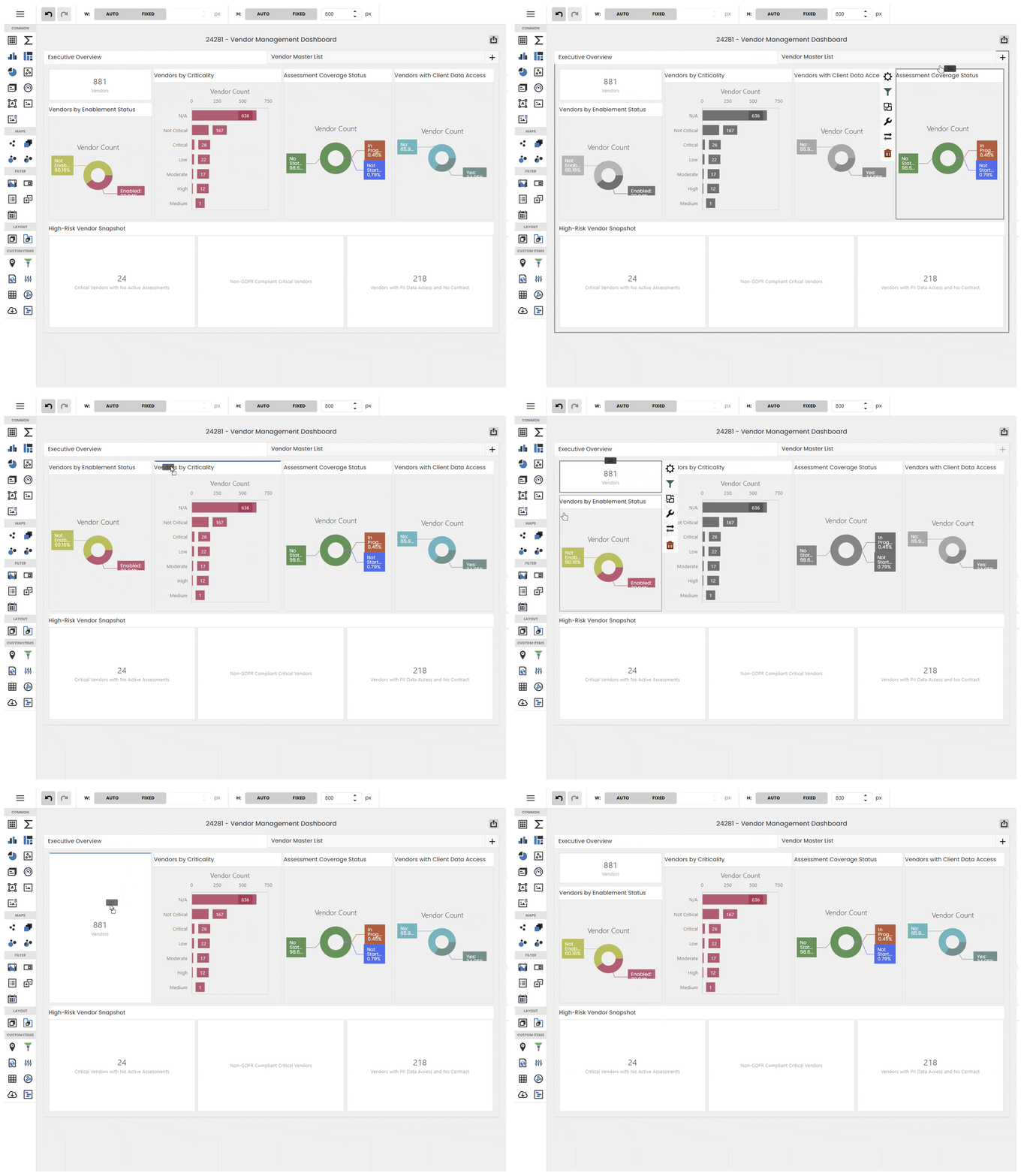
Drag and Drop: Easily rearrange dashboard items by dragging and dropping them into the desired position. Enhances the customization and interactivity of your dashboard.
Resizable Panels: Adjust the size of each dashboard item to focus on the most important data. Allows for a customized view of your dashboard.
Updated about 6 hours ago